ASSOCIATION

SERVIZI ADICI

COMMUNICATIONS

2025 A.DI.CI
All rights reserved
Via Martini, 69
Castiglione delle Stiviere (MN)
C.F. 90019730200
info@adici.it
|
| Saturday, 5 april 2025 |
ITA | ENG |


| ASSOCIATION | LOGO
Logo
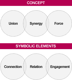
 The A.DI.CI logo has been designed to emphasise to the utmost the concept of entrepreneurial synergy, starting from the geometric shape of a circle. The A.DI.CI logo has been designed to emphasise to the utmost the concept of entrepreneurial synergy, starting from the geometric shape of a circle.
In fact, as well as recalling the circular knitting machines used to produce ladies' tights, men's socks and underwear, this form has a universal, symbolic meaning extremely relevant to the association's mission.
|

|
| |
|

|
The businesses in the group are visually represented by the universal symbol of the circle (sun, energy, harmony), in which each of them retains its individual character but is, at the same time, strengthened by its bond with the other members.
The gaps in the loops give a lighter, more dynamic logo, suggesting a bond which is not heavy and restrictive but which leaves plenty of room for the autonomy of the individual.
|
|
|


